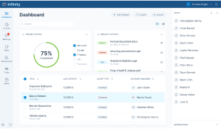
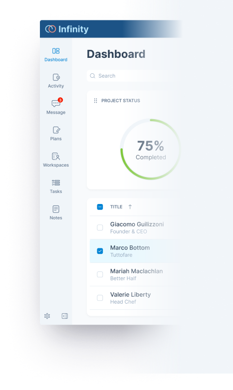
Let users easy to identify target navigation item.
Scalability
Reserve spaces for adding new modules.
Design Decisions
Minimal & Simple Design Style
Display navigation items with good clarity. Use primary color to highlight current module without distracting users’ focus.
Full Height Bar
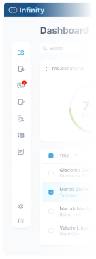
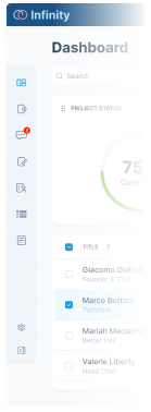
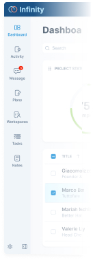
A few design options have been created. Design 3 was selected to optimize screen space utilization.
Experiment
Design 1
Floating Island
Design 2
Subtle Bar
Design 3
Full Height Bar
Figma Component
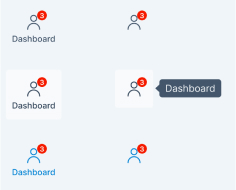
Apply Atomic Design methodology to design the navigation bar, considering multiple states. Leverage Figma's component variants feature to increase productivity.
1
Molecule Level
Navigation Item
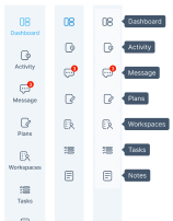
Design the navigation item with states using atomic components like icons, labels, badges, and tooltips.
2
Organism Level
Navigation Bar
Combine navigation items to create a navigation bar with collapsed and expanded states.
3
Page Level
Full Height Bar
Apply the navigation bar to the app shell and adjust the component for various screen sizes.